 Beach accents add a calming feel to a room, whether through found objects like shells or an ocean-like liquidy turquoise for wall paint. I used all of the above in my dining room, from a hurricane filled with sand and starfish to a faux coral piece on a shelf to a capiz chandelier over the table.
 Because my apartment is small, I also have an extra chair in the room, which has a small accent pillow with coral. Then I added a coral votive. Then I started to think ... when does a room evolve into becoming too "done." Themed rooms are common for kids' spaces, but what about adults?
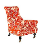
For the most part I think if you're staying true to yourself and you like the look, it's OK. I chose to have a focal shelving unit which houses all my capiz frames, shells, etc. But they are all white, which cuts down on the clutter. My walls are turqouise, which offers a contrast to the stark objects. Plus I introduced orange into the room through framed art and the orangish coral. My rug brings all the colors together: orange (more of a peachy tone really), turquoise, beige, purple (from my living room).

I also love the color and graphic image on this Dermond Peterson Coral Red Linen Pillow, and this Red Coral Needlepoint Pillow from Bellacor.


Here's my coral pillow (below) from Pier 1 (like $7 on clearance!).


Quote of the Day: "Most people don't realize that large pieces of coral, which have been painted brown and attached to the skull by common wood screws, can make a child look like a deer."
-- (Deep Thoughts with) Jack Handy
1 comment:
Beautiful rooms. Thank you for sharing your ideas! I have a chance to get one of these Pier 1 capiz chandeliers. Have you been happy with it? Do the shells seem too sparse or the light too bright or dim? :) Thanks!
Post a Comment